Security & Data Protection SaaS website Page
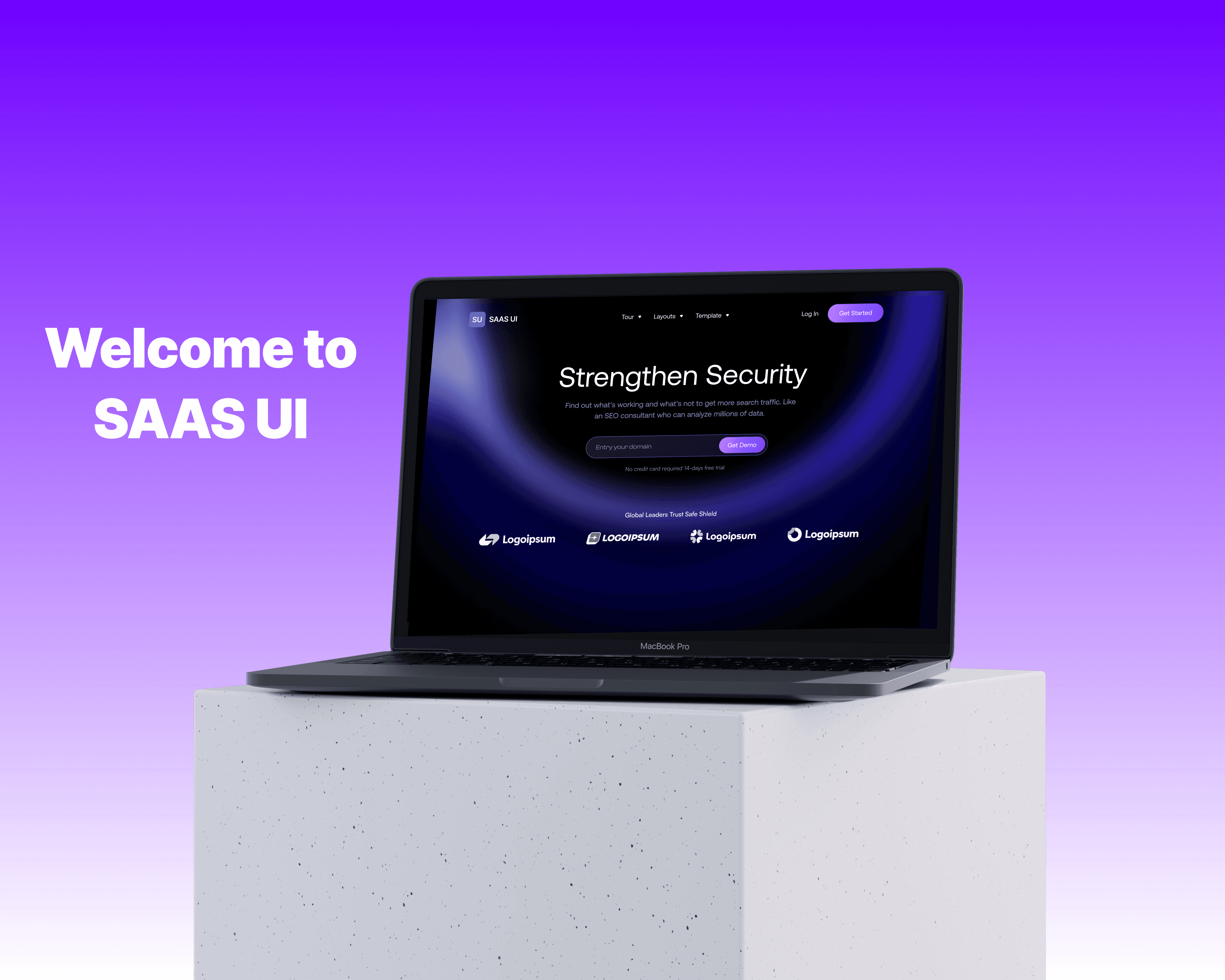
I designed a futuristic, visually striking landing page for SafeShield, a SaaS platform providing enterprise-level data security, encryption, and compliance solutions. The goal was to create a high-impact design that reflects trust, innovation, and cutting-edge technology while presenting technical information in an approachable way.
Challenge
✅ Convey highly technical security concepts in a way that feels accessible yet authoritative.
✅ Maintain readability and focus while using a dark, high-contrast futuristic theme.
✅ Balance visuals, copy, and metrics to build trust with a corporate audience.
✅ Integrate testimonials and thought leadership to establish credibility.
Results
✅ Delivered a visually memorable and professional landing page aligned with SafeShield’s cutting-edge security brand.
✅ Improved clarity of complex concepts through intuitive layout and clean messaging.
✅ Early testing showed increased engagement and a higher perceived sense of trust and authority.
✅ Helped position SafeShield as an innovative and reliable solution in the crowded SaaS security space.
35%
Improved onboarding process
25%
Increase in user retention
84%
Increase in time spent on website


Process
Research & Analysis: We conducted user interviews, surveys, and analyzed in-app analytics to understand the pain points and user needs. We also studied competitor apps and industry trends to gather insights
Information Architecture: Based on the research findings, we restructured the app's navigation and content, prioritizing features and information according to user needs.
Wireframing & Prototyping: We designed low-fidelity wireframes to visualize the new layout and navigation, iteratively refining them based on user feedback. Afterward, we built a high-fidelity, interactive prototype to test the design.
Usability Testing: We conducted usability tests with a diverse group of users to validate the design and identify areas for improvement. Based on the feedback, we made necessary adjustments to the design.
Visual Design & Style Guide: We developed a cohesive visual language, including color schemes, typography, and iconography, ensuring consistency throughout the app. We also created a style guide to maintain design consistency in future updates.

“ With our new visual branding and language in place, the new Shopify brand clearly captures the essence of our current and target customer base, our employees, and our values. ”
Tobias Lütke
CEO, Co-founder | Shopify


Conclusion
The modernization of the subscription management platform successfully addressed the core usability issues and improved the overall user experience. By focusing on simplifying the interface and optimizing workflows, we were able to create a more efficient and enjoyable platform for users. The significant improvements in user engagement, satisfaction, and subscription rates underscore the importance of user-centric design in achieving business success.
